Perhaps “sucks” is a bit strong of a word, but Mighty No. 9 certainly isn’t good. It isn’t the game I think most of us thought we’d be getting. The repeated delays were a warning sign, but they came far too late.
Playing Mighty No. 9 I feel like I can see the blue bomber in there, somewhere. He’s just trapped beneath the surface. And being suffocated by odd design decisions and questionable level design.
Now bear with me, as I’ve not actually played a Mega Man game in nearly a decade… but I seem to recall that collecting certain boss’ weapons proved helpful for defeating other bosses. And so there was a strategy to the order you chose to tackle the levels. Thus I was fairly disappointed as I started clearing bosses with just the base weaponry, and found no particular reason to go hunt down a boss’ particular weakness.
I did like the dash mechanic, which is something Mega Man never had… but the level design is constantly working against you, putting up obstacles and barriers that prevent you from maintaining any sort of momentum. As soon as you start feeling a rhythm zipping along through your foes, you’re forced to stop.
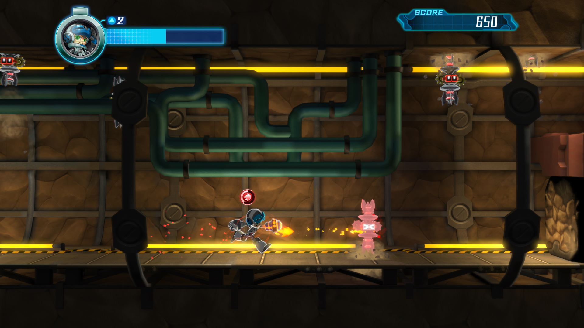
I also cannot help but be disappointed with the visuals of the game. It’s hard for me to imagine that in this day age, this sort stylized, sidescrolling aesthetic is all that hard to execute cleanly, and yet everything seems muddy, with varying degrees of resolution to the textures. There are points where I stopped entirely and questioned “did they forget to finish this part?”
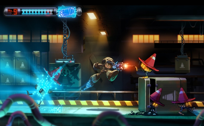
Take a look at the art used to sell us the concept back during the Kickstarter:

It’s not unreasonable to think that the game was aspiring to look like this. It is, after all, a sidescrolling endeavor. Even in the switch from 2D art to 3D elements, I’d like to think I’m not the only one who thought this was the direction they were going. Instead we got this:

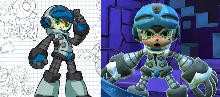
I don’t find the graphics to be at all impressive. It feels, as I said above, unfinished. The textures are bland, the particle effects are dull and messy, and the models feel fuzzy and rudimentary. Even the game’s hero, Beck, seems to have lost something crucial in the translation from concept to game element.

The character we were first shown has attitude. There’s a sleekness in his design that definitely evokes that classic Mega Man look, but updated with the fidelity of detail that games of today can support. In-game, however, he looks like a tortured ballon animal.
Mighty No. 9 is, at it’s best, playable. But it doesn’t feel like the game we were promised. Capcom doesn’t seem terribly interested in Mega Man as an ongoing franchise, and Mighty No. 9 looked like our best shot at bringing the formula into the current generation. But for some reason, Keiji Inafune has been unable to reproduce the recipe here. It’s not because the new elements brought to the table didn’t work… in fact I feel they did, to a degree. But some of the important basics, like precise jumping, and shooting, fell by the wayside somewhere along the way.


