There were a ton of great entries, but I’ve managed to select ten finalists that I feel capture the goal of the contest, which was to convey “Light Side” or “Dark Side” though photo-manipulation of a SWTOR screenshot.
Now it’s time for you guys to choose the winners! The top three finalists will each receive a SWTOR Razer Mouse and Mousepad courtesy of Razer!
And without further ado, here are finalists and why I chose them! (Click the Entry # to see a larger image)
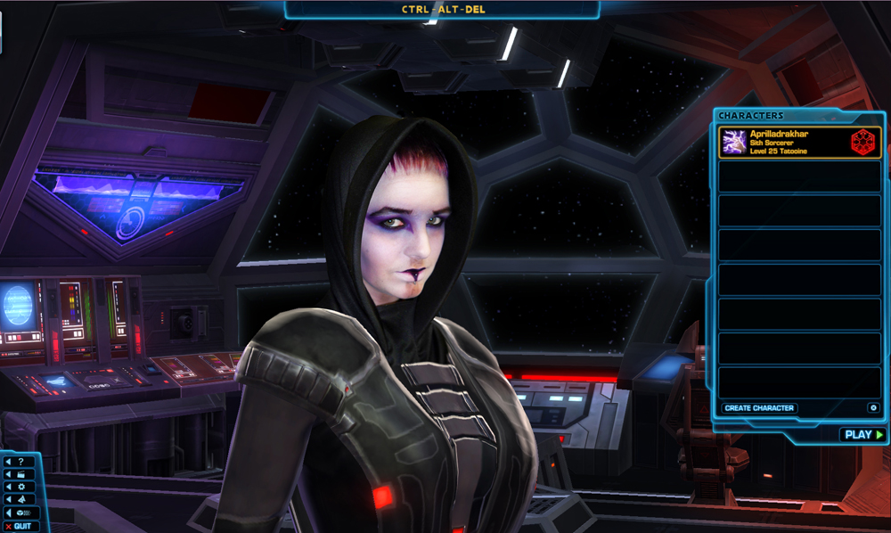
This one was really cool. Kaelee actually painted her face to match her Rattataki Sith Inquisitor (including the Imperial Alphabet scars that spell out her character name) and then superimposed the picture onto her actual character in-game. Definitely looks like she’s turned to the dark side to me!
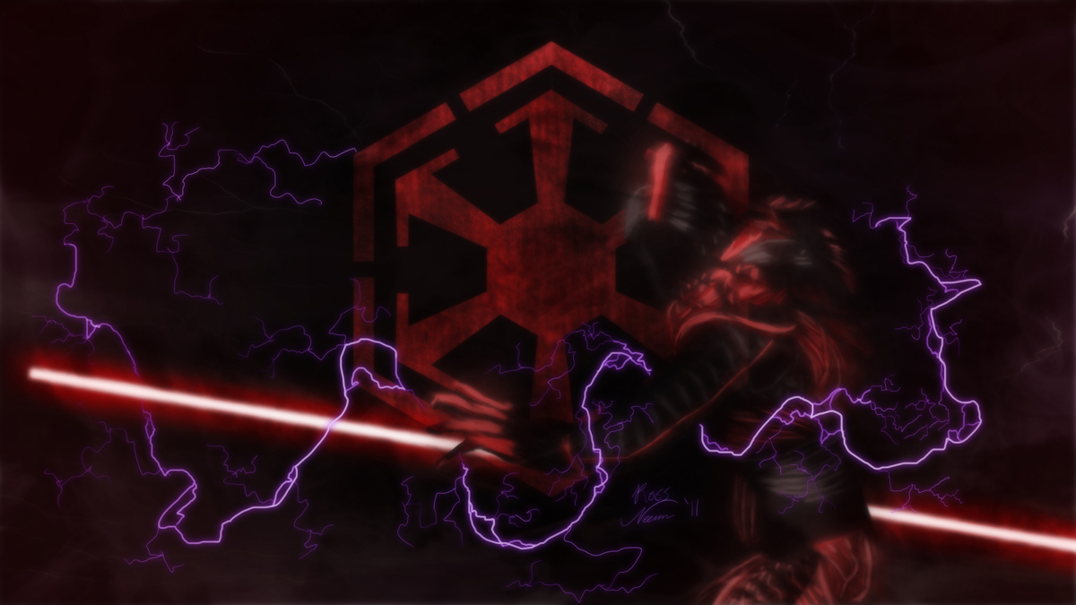
Ross painted over this screenshot to create an almost wraith-like Sith spectre. It’s a little on the dark side (dur hur), but the effect is really cool.
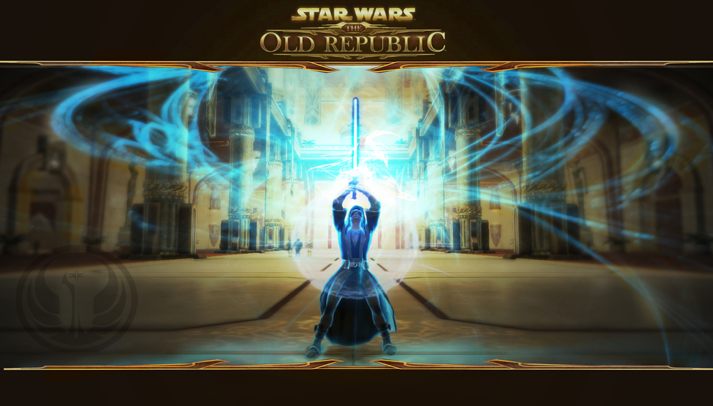
We didn’t get a lot of Light Side entries (I think Dark Side is easier to show visually), but this one stood out. That character pose must be an emote in game, because I saw a few entries that used it, but either way, this submission definitely said “Light Side” to me.
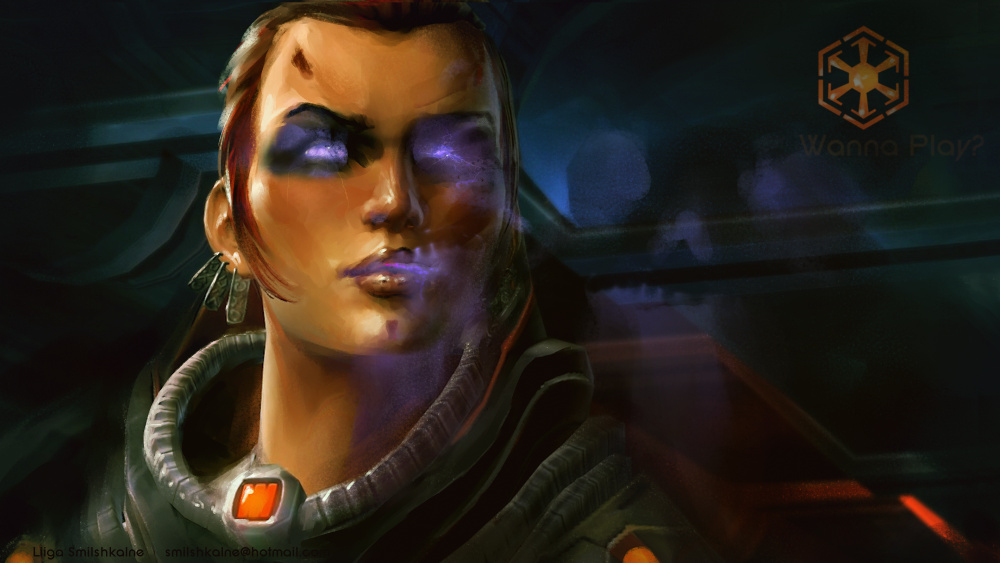
I was blown away by this entry, because at first glance I thought it was just a straight-up painting. But Liiga actually painted over this screenshot and added some Dark Side flair. Really cool!
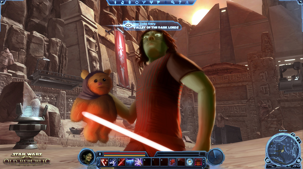
I couldn’t decide if this entry was Dark Side or Light Side… I almost feel like killing Ewoks would be considered a good thing.
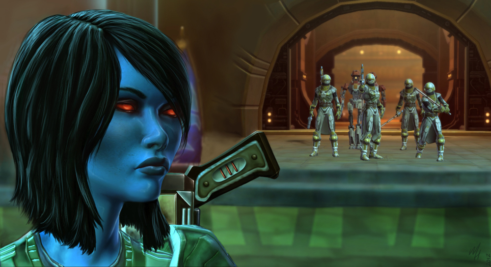
Megan didn’t tell me much about her entry, but it definitely looks like there was some photoshop/enhancement to a screenshot of her Chiss here that looks great!
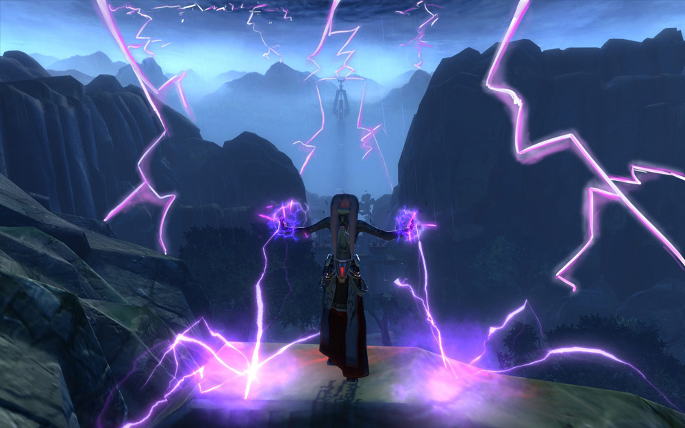
I’m not sure where in the game this was taken, but this just screamed Classic Dark Side.
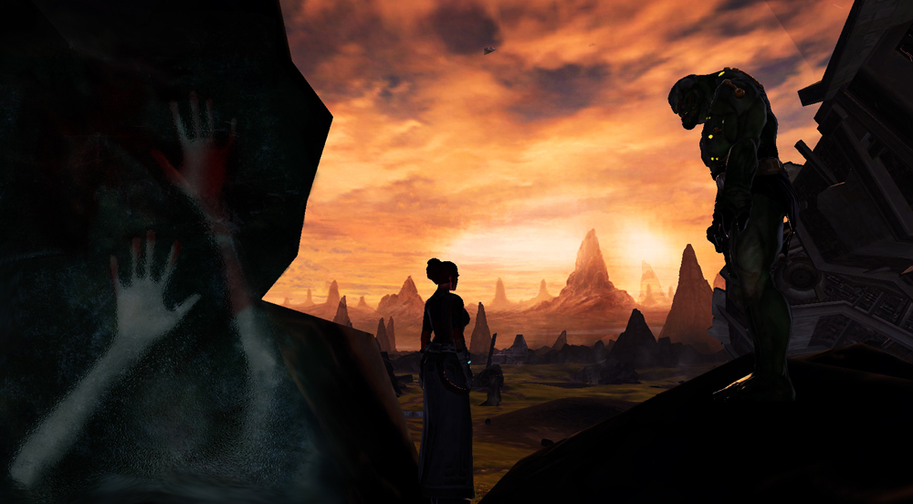
Alyx called this one “Trapped in the Dark Side”, and I thought the overall composition of the image was fantastic.
I just thought this one from Bryan was clever and amusing!
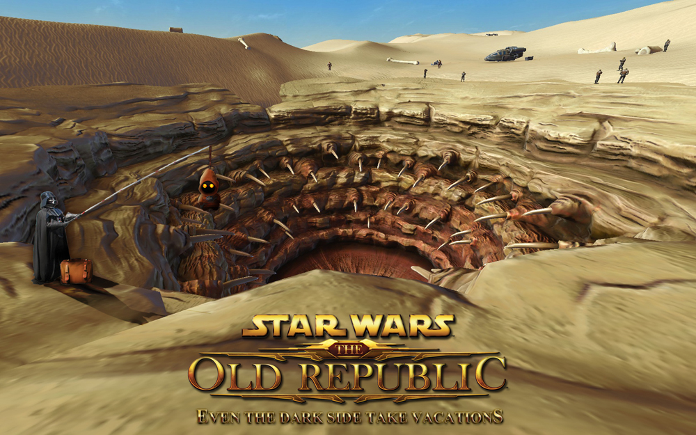
I absolutely loved the colors and layout of this submission by Valerie. It has a very artistic visually interesting look to it, like something you’d frame and hang up.
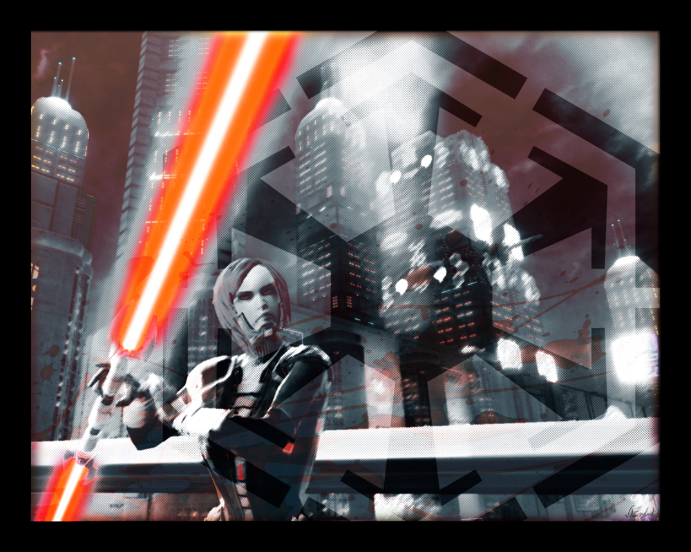
So that’s it! Those are the ten finalists. Now it’s time for you to vote! Voting will close Sunday at midnight, at which point the top three entries will be declared the winners! (I had a problem with the previous poll, so I had to reset it. If you voted earlier, please feel free to recast your vote!)


